During close coordination meetings, we like to surprise our customers with good design ideas.
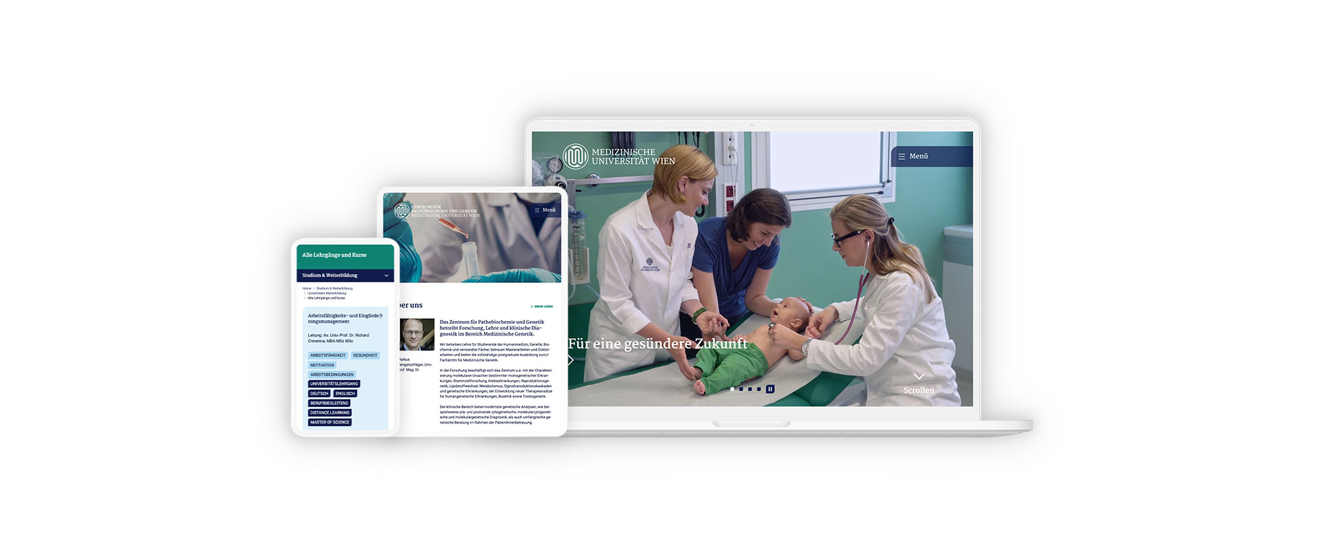
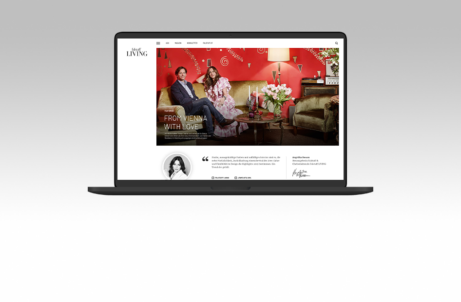
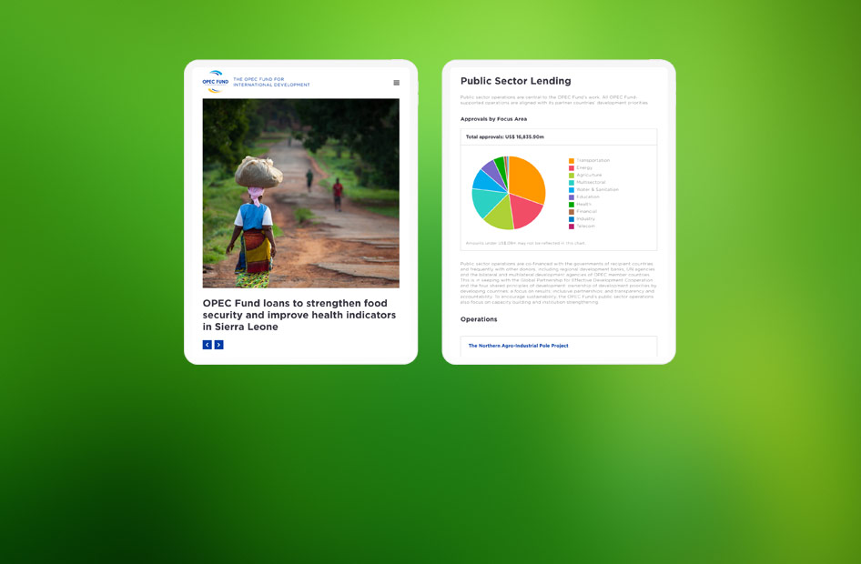
User Interface Design Your UI design agency for actual users.
As captivating as a Hollywood blockbuster or as mundane as a C-List telenovela? How hot a website or an app feels depends primarily on the user interface design, or GUI for short.
Scroll
Interfaces for Real Users
What sometimes frustrates our technicians: everyone only looks at the design. But that’s the way it is. The technology “only” has to function smoothly, but the design has to be fascinating. The design of the user interface of a website or app draws the user in. Or not.
Just as you can tell after a few seconds of streaming a new show whether you’ve caught a great production or an uninspired telenovela, you can sense the design quality of a website at first glance. And the old rule still applies: you never get a second chance to make a first impression.
We ensure that you always make the very best impression on your customers with your digital offerings – and we do a lot to make certain that only the best screen designers work at Fonda. True to our motto “Outside view instead of inside view”, we consider the real users to be the benchmark for good design.
Our screen designers have a strong sense of value and are always a step ahead of the game. This is how their designs come across as fresh and stay young for a long time. Of course, they also have the strategic experience and the craftsmanship to set up a new design “from scratch” and to develop a completely new corporate identity with digital products.
From Corporate Design to Responsive Design
Many of our customers already have a strong corporate identity and an established corporate design. We adopt these for digital projects and derive the screen design from them, so that the digital offerings fit harmoniously into the series of other media channels.
01
06
01
06
01
06
01
06
01
06
01
06
Swipe
Experience Meets the Desire for Something New
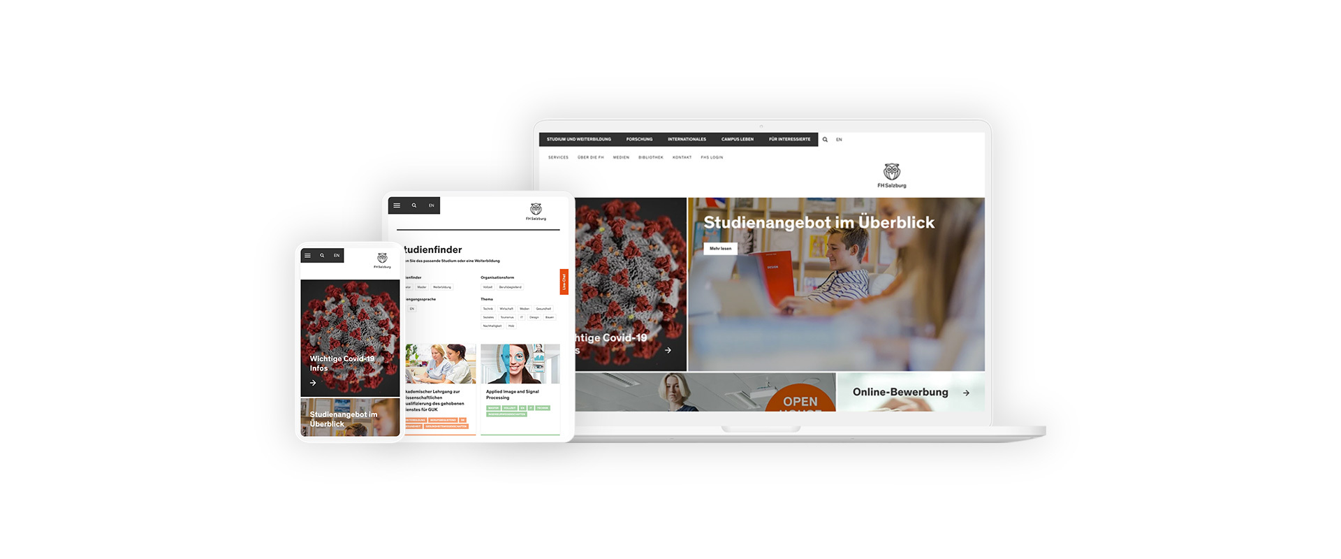
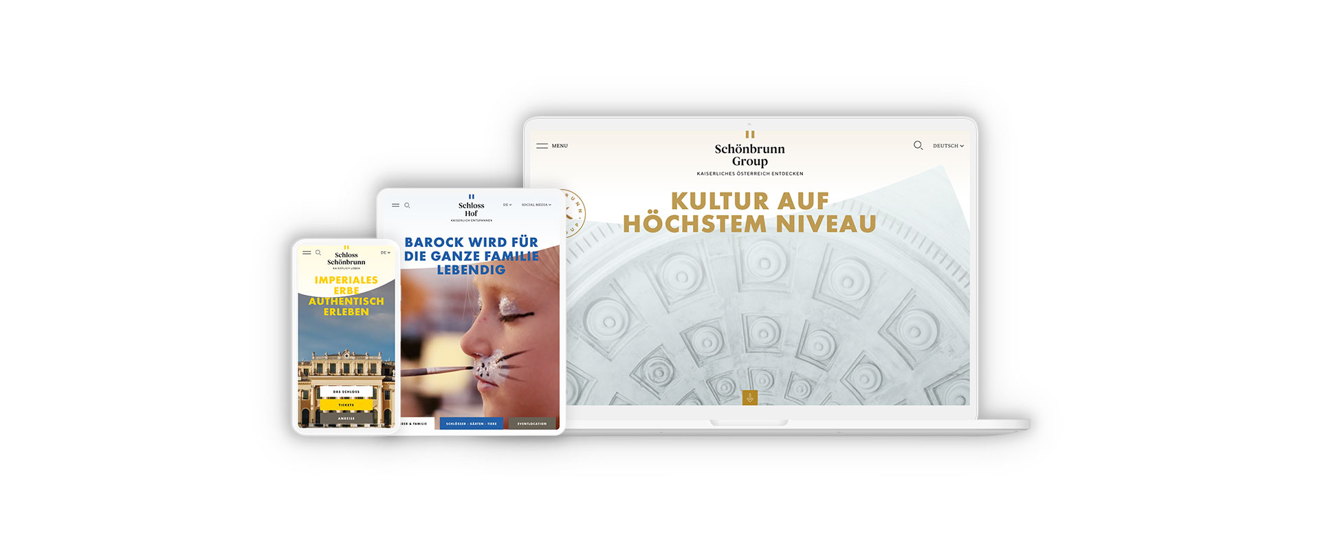
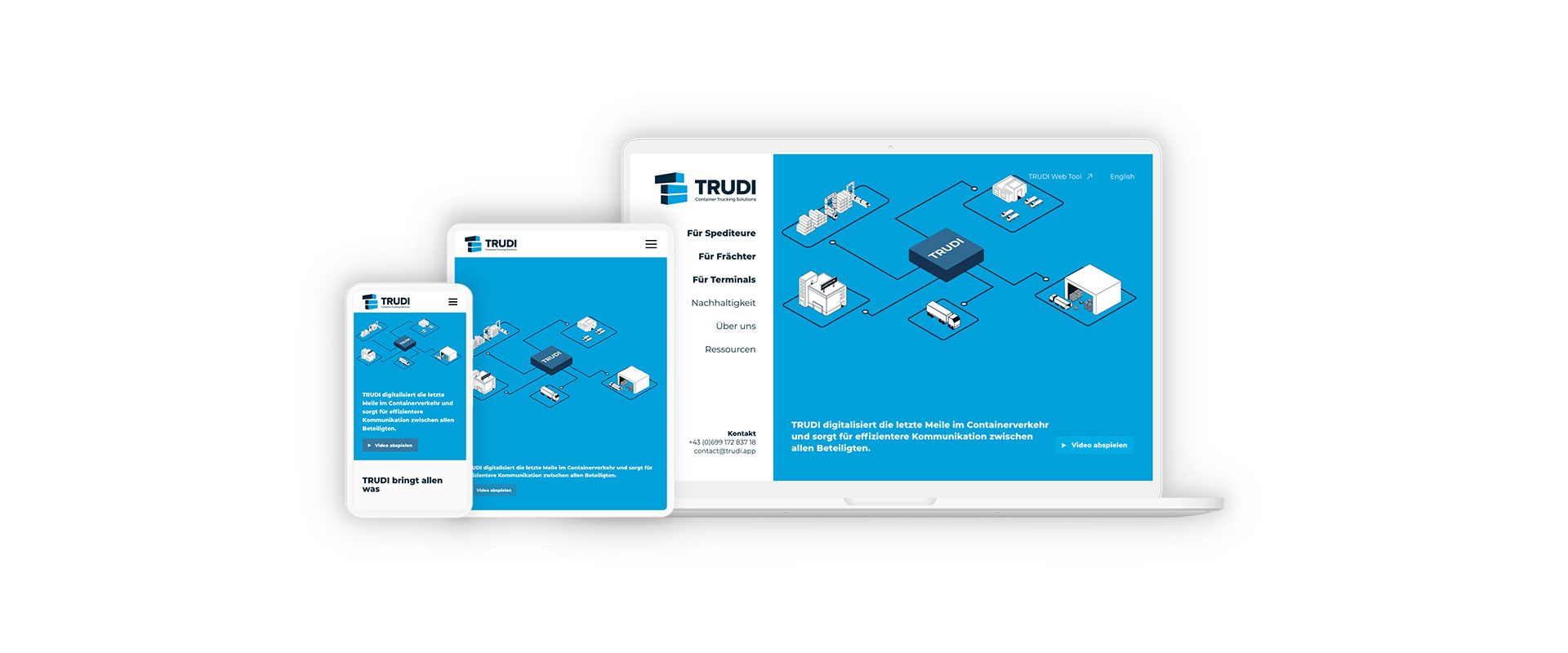
People obviously enjoy working at Fonda because we only have slight fluctuations in personnel. This is a great advantage because it allows our screen designers to gain experience with a wide variety of customers from a wide range of industries. This ranges from a website for a top Austrian tourist attraction to a terminal for the foyer of an international development bank to an app for long-distance truck drivers.
Being able to adapt to all these customers requires a great deal of empathy – not only for different end customers, but also for different business models. But it also requires not losing your desire for new things and constantly educating yourself.
Lifelong Learning Through Interaction
An essential part of the mosaic in the further training of our employees is daily interaction. Both our UX designers and our UI designers are in constant contact with the front-end developers to get inspiration from the technical side. This way, they learn first-hand about new technical functionalities and new digital possibilities and can easily check the feasibility of bold design ideas.
3 + 1 Steps to a Convincing UI Design
1. Basic UI Design Development
One stands well on a good foundation. This is also true in design which is why we start by developing a foundation. Based on a well thought-out UX design, our UI designers create a number of important page types and modules in order to coordinate the essential design elements with our customers.
For some projects, it is valuable to do acceptance checks with selected user groups in this early phase in order to have the basic design assessed by those who need to like it the most.

Designs with a Wow-Effekt.
2. Developing Responsive Screen Designs in Detail
We only use responsive websites, preferably based on Bootstrap. We rely on modular GUIs to make our screen designs as flexible and efficient as possible. For smartphone resolutions, we have come up with additional special modules.
In keeping with the “mobile first” design approach, smartphones are almost always the starting point in our development. There are really only a few projects where this doesn’t make sense.
We hand over the design templates for the front-end to the front-end programmers in work packages. This allows UI designers and developers to work concurrently – guaranteeing tight schedules.
3. Taking Time for Testing and Design Reviews
A shifted pixel here, or “just off” there – something like this can seriously disturb the overall impression. That’s why our UI designers are involved in the testing process. In careful reviews, they expose every inaccuracy and can add the finishing touches to the design in this phase.
4. Documenting the Design in a Style Guide
One of the straightforward questions clients ask us is: do we need a style guide? Our answer is always “yes”. A style guide ensures the value of the development. Without a style guide, uncontrolled developments usually begin just a few weeks after the launch, which takes away the focus and professionalism of the product.
However, there are a whole range of style guides – from a relatively simple file to a dynamic online platform with detailed descriptions and code snippets.
To give you an idea of what’s possible, we’ve put together a table of the most common types of style guides.
| What Is It? | What Does It Provide? | Who Is It For? |
| Design Documents | Detailed description of the design elements: colour values, dimensions, icons, breakpoints and everything else related to a design; Extra: Dos and Don’ts |
Designers Developers |
| Design Concept Documents | Formulated design concept with derivation: description of all modules and their purposes; guide to content production; detailed content structure – complete with all do’s and don’ts |
Concept Developers Designers Developers Editors |
| Wording Guide | Specifications for uniform writing styles; instructions for media-appropriate writing, for strengthening SEO through content and for user-centred texts | Editors |
| Living Style Guide | Online platform with a description of all front-end modules and elements including code snippets that can be incorporated without modification; optional: instructions for use |
Concept Developers Designers Developers |
Fonda’s Extra Tip: a UI Style Guide that Makes Sense
For a style guide to work as it should, it must be designed to meet needs. This means that there are a few things to keep in mind to ensure that the style guide fulfils its purpose. Namely, to preserve the “beauty” of the new product for a long time.
- Precisely determine target groups and purpose
- Ask representatives of the target group in a structured way what is particularly important to them, what did not fit well in previous guides, how and to what extent will they use the guide
- Design a clear structure that is appropriate for the target group
- Make presentations sufficiently large and clear
- Clearly articulate in sophisticated everyday language, using consistent terminology
- Set up a "Living Style Guide" as a website instead of a simple PDF document. Then the style guide can be dynamically expanded and is always up to date. Errors that can occur when using an outdated style guide version are excluded with online style guides.
Web or App?
Many of our customers pursue a multichannel approach and operate websites and apps with partially overlapping content and functional areas. We now generally recommend joint UI design development for websites and apps. The usage patterns of both are now similar. Therefore, in terms of efficiency and consistency in the user experience, it is obvious to strive for a UI design that is similar to a large extent. Of course, we develop different mutations: on the one hand to meet the requirements of app operating systems, and on the other hand to be able to exploit all the possibilities for an optimal user experience.
Giorgia Scaramuzza.
UX & UI Design